Map Pastel Color Beige
Created on January 26, 2025
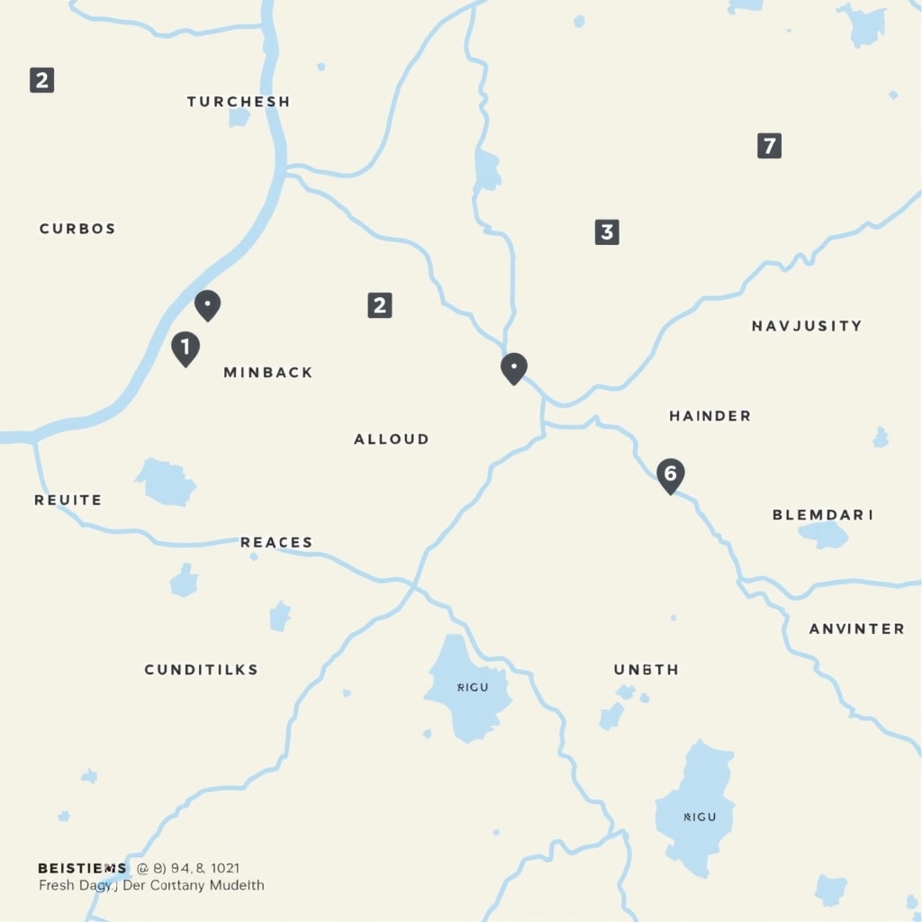
Prompt
Map Design Breakdown Prompt:
-
Background: Use a light pastel color (e.g., light beige) instead of white for the map's background to create a softer visual appeal.
-
Roads: Change main road color to a dark gray for better contrast against the background, and use a lighter shade for secondary roads.
-
Labels: Opt for a more modern sans-serif font for all text. Change the label color to a darker hue (e.g., navy blue) for better readability.
-
Marker Style: Replace circular markers with square markers. Use a subtle drop shadow for a 3D effect. Inside the markers, use a lighter color to highlight the number.
-
Grid Lines: Introduce faint grid lines in a light gray to aid navigation without overwhelming the design.
-
Landmarks: Remove specific brand or regional references. Replace them with generic icons (e.g., park symbols, building icons) scattered across the map to represent different points of interest.
-
Legend: Add a simple legend in one corner to explain marker meanings using minimal text.
This design invites a fresh perspective while maintaining map functionality.