**Design Breakdown:**

1. **Color Palette:**
   - Use warm beige and earthy tones, replacing deep brown with a lighter peach hue.

2. **Layout:**
   - Two rectangular blocks with rounded corners, stacked vertically.
   - Maintain a similar layout but adjust the dimensions for a more dynamic, asymmetrical arrangement.

3. **Header:**
   - Change the oil names to "Essential Oil 1" and "Essential Oil 2."
   - Use a bold, modern font for the names, ensuring they stand out.

4. **Subheading:**
   - Replace the taglines with "Versatile for Everyday Use" and "Enhances Health & Flavor" in a sleek sans-serif font.

5. **Body Text:**
   - Revise text to "Ideal for cooking and personal care, this essential oil brings nourishment to your life." for the first block.
   - Change the second block text to "A staple for flavor and health benefits in your kitchen."

6. **Images:**
   - Substitute the images with abstract illustrations of plants or ingredients that represent the oils without specific references.
   - Use a minimalist style for the illustrations to keep the focus on the text.

7. **Iconography:**
   - Include simple line icons representing cooking and skincare, positioned subtly at the corners of each block.

8. **Background:**
   - Integrate a soft gradient background, shifting from peach to cream, to create visual interest without overwhelming the content.

By implementing these changes, you create a fresh and engaging design that maintains functionality while removing brand references.

Color Palette Warm Beige Earthy

Created on January 4, 2025
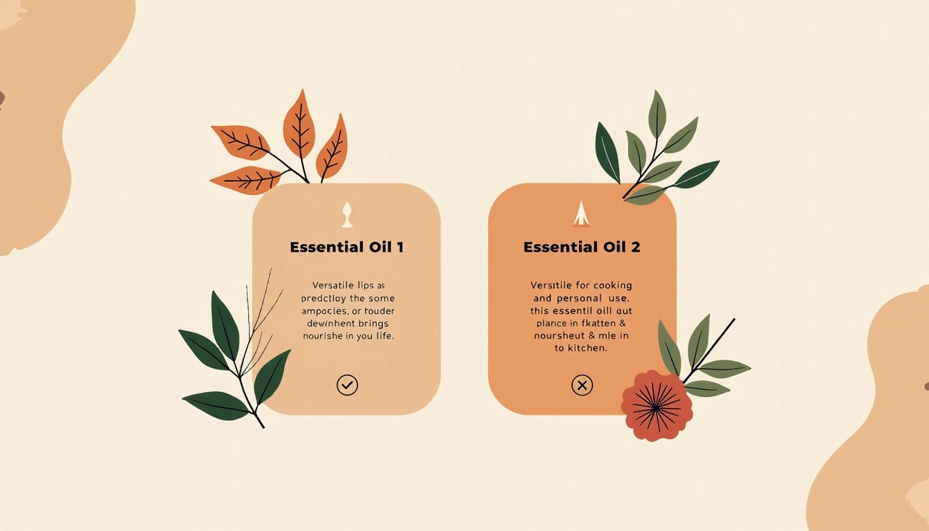
Prompt

Design Breakdown:

  1. Color Palette:

    • Use warm beige and earthy tones, replacing deep brown with a lighter peach hue.
  2. Layout:

    • Two rectangular blocks with rounded corners, stacked vertically.
    • Maintain a similar layout but adjust the dimensions for a more dynamic, asymmetrical arrangement.
  3. Header:

    • Change the oil names to "Essential Oil 1" and "Essential Oil 2."
    • Use a bold, modern font for the names, ensuring they stand out.
  4. Subheading:

    • Replace the taglines with "Versatile for Everyday Use" and "Enhances Health & Flavor" in a sleek sans-serif font.
  5. Body Text:

    • Revise text to "Ideal for cooking and personal care, this essential oil brings nourishment to your life." for the first block.
    • Change the second block text to "A staple for flavor and health benefits in your kitchen."
  6. Images:

    • Substitute the images with abstract illustrations of plants or ingredients that represent the oils without specific references.
    • Use a minimalist style for the illustrations to keep the focus on the text.
  7. Iconography:

    • Include simple line icons representing cooking and skincare, positioned subtly at the corners of each block.
  8. Background:

    • Integrate a soft gradient background, shifting from peach to cream, to create visual interest without overwhelming the content.

By implementing these changes, you create a fresh and engaging design that maintains functionality while removing brand references.